How to Write Responsive HTML Tables (for Markdown Sites)
Recently, I've had tables on the brain. An earlier version of my blog post about how Google Fonts can affect page speed included tabular representations of page loads using different methods of loading Google Fonts, and I just couldn't get it to fit on a phone-sized screen.
Here's how the table looked in mobile Chrome:
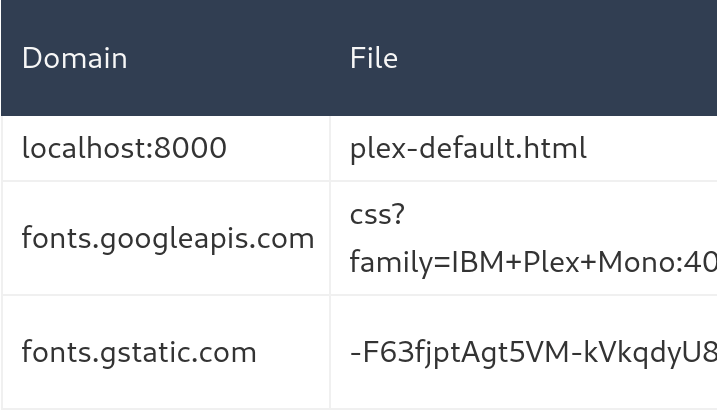
Ouch. There are supposed to be three columns. On a phone, in the one hand, that table is bifurcated. On tablet (or larger device), in the other hand, that table would look rather handsome.
(If you're dual-weilding a phone and a tablet, would you tap the screens with your nose?)
So I got to thinking: what are some ways to make tables more responsive and help prevent those tables from overflowing on smaller screens?
This post will cover why tables are overflow-prone before presenting a few methods of making them more responsive. Plus, because I write these blog posts in Markdown using a static site generator, I'll comment on how easily each method of reducing overflow works with a Markdown-based static site.
Let's get to it.
The problem
The reason tables overflow is that they are too wide.
"Well, duh."
Okay, that may seem obvious, but solving this problem requires an answer to this question: how does a browser calclate a table's width?
The answer is table-layout:
By default, most browsers use an automatic table layout algorithm. The widths of the table and its cells are adjusted to fit the content. MDN - table-layout
So, browsers use an automatic table layout algorithm to determine how to render a table's columns and rows. What does that algorithm look like? To answer that question, we'll go straight to the horse's mouth. (What does a horse's mouth look like? Like a pony's, but bigger. What does a pony's butt look like? Hey, now.)
The W3C, the Web standards organization led by Tim Berners-Lee, the inventor of the Internet, describes an algorithm to determine a table's column widths in the "Automatic table layout" section of the CSS 2 Tables spec.
The algorithm described in the spec is a mouthful—nay, a horse's mouthful. Here's a more bite-sized version:
- Try to fit columns in a table without breaking lines in the column's cells. (These are the columns' max widths.)
- If there's space left over, distribute it among the columns
- If the columns at their max widths are wider than the table, shrink columns to their minimum widths
- If that's too wide, overflow the table's container
So, if a table's content is too wide, causing the table to overflow, we really only have three options:
- Reduce the number of columns
- Handle the overflow
- Reduce columns' max width
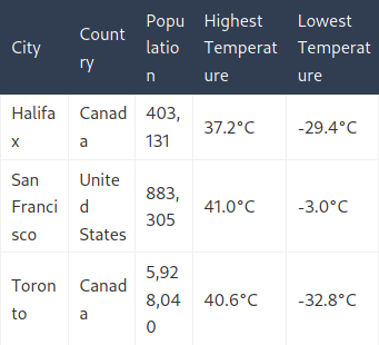
In this article, we'll apply each strategy to the following table, which in my browser has a max width of 626.2px and a min width of 456.2px:
| City | Country | Population | Highest Temperature | Lowest Temperature |
|---|---|---|---|---|
| Halifax | Canada | 403,131 | 37.2°C | -29.4°C |
| San Francisco | United States | 883,305 | 41.0°C | -3.0°C |
| Toronto | Canada | 5,928,040 | 40.6°C | -32.8°C |
Mitigation 1: Reduce columns
A reliable way to reduce the width of a table is to reduce the number of its columns. Every column in a legible table comes with some horizontal padding in its cells and a border separating columns. As a result, removing one column from a table will reduce the width of that table by the width of the column's widest cell, plus its cells' horizontal padding, plus the width of one column border.
Let's take the city table and examine two ways to reduce its column count.
1.1 The Lazy Susan, or the Turntable
This method works when a table has more columns than it does rows. The cities table above is has 5 columns and 4 rows (5x4). If we rotate the table so the cities are along the top, we can transform it into a 4x5 table:
| Halifax | San Francisco | Toronto | |
|---|---|---|---|
| Country | Canada | United States | Canada |
| Population | 403,131 | 883,305 | 5,928,040 |
| Highest Temperature | 37.2°C | 41.0°C | 40.6°C |
| Lowest Temperature | -29.4°C | -3.0°C | -32.8°C |
Not every table will lend itself well to this type of rotation. For tables that do work in this orientation, however, this is an easy way to decrease a table's width, and it works out-of-the-box in Markdown.
| Measurement | Value | Reduction |
|---|---|---|
| Max width | 428px | 32% |
| Min width | 342.2px | 25% |
1.2 Column Compacting
Some tables have columns that can be joined together without losing any information. In the city table, the highest and lowest temperature columns can be joined to form a "Temperature Range" column. Because the table isn't sortable, it's a simple space-saving solution.
| City | Country | Population | Temperature Range |
|---|---|---|---|
| Halifax | Canada | 403,131 | -29.4°C to 37.2°C |
| San Francisco | United States | 883,305 | -3.0°C to 41.0°C |
| Toronto | Canada | 5,928,040 | -32.8°C to 40.6°C |
It could make sense to break the joined columns across lines for more control over where the content breaks across lines:
| City | Country | Population | Temperature Range |
|---|---|---|---|
| Halifax | Canada | 403,131 | Low: -29.4°C High: 37.2°C |
| San Francisco | United States | 883,305 | Low: -3.0°C High: 41.0°C |
| Toronto | Canada | 5,928,040 | Low: -32.8°C High: 40.6°C |
Adding manual <br> tags is a minor inconvenience in HTML and Markdown, but if it helps reduce table width and doesn't hurt content presentation, it's a good trick for one to keep up one's sleeve.
| Measurement | Value | Reduction |
|---|---|---|
| Max width | 458.7px | 27% |
| Min width | 347.7px | 24% |
Mitigation 2: Handle overflow
A classic way to handle table overflow and make a table more responsive is to treat the table like a gift and wrap it.
Bootstrap implements responsive tables by wrapping tables in a <div> with overflow-x: auto. With this emballage, tables that are too wide for their container or the browser's viewport width will overflow, but the overflow will be visible by scrolling horizontally.
Here's an example of the markup required, adapted from Bootstrap:
<style>
  /* Simplified version of Bootstrap's responsive table CSS */
  .table-responsive {
    display: block;
    width: 100%;
    overflow-x: auto;
  }

  .table-responsive > table {
    width: 100%;
  }
</style>

<div class="table-responsive">
  <table class="table">
    ...
  </table>
</div>
Using a responsive table wrapper like this is no big deal in an HTML-based site, but for a site where HTML is generated from Markdown, the wrapper can be a pain. Many Markdown processors, including markdown-it and Python-Markdown, render HTML elements in a Markdown document as HTML elements—which makes sense.
This means that Markdown table markup will be considered text instead of a Markdown table. And that means that this method of making a table response requires either:
- writing tables as HTML, which is grody
- using a Markdown extension that can parse Markdown tables inside an HTML element
- For Python-Markdown, see ExtraRawHTML
The min/max width comparison for this method doesn't make much sense because a table using a scrolling wrapper will have a min width of 100%. Because the table's overflow will be visible with scrolling, its max width isn't worth keeping track of either.
Mitigation 3: Word Wrapping/Breaking
Pop quiz: what is the widest column in the city table?
The answer: any column containing the word 'Temperature'. 'Temperature' has eleven characters, and on my browser the word is 98.5px wide.
A column's min width is the width of the longest unbreakable string of characters in its cells. "Unbreakable", eh? We'll see about that.
3.1 Hyphenation
With a bit of extra markup, it's possible to tell browsers where it makes sense to insert hyphens. That markup is the soft hyphen, ­.
U+00AD (SHY)
An invisible, "soft" hyphen. This character is not rendered visibly; instead, it marks a place where the browser should break the word if hyphenation is necessary. In HTML, use
­to insert a soft hyphen. MDN - hyphens
The soft hyphen can come in handy when dealing with text that browsers may not know how to hyphenate, like names of people, brands, and places. Have you ever been to Llanfairpwllgwyngyllgogerychwyrndrobwllllantysiliogogogoch?
| City | Country | Population | Highest Temperature | Lowest Temperature |
|---|---|---|---|---|
| Halifax | Canada | 403,131 | 37.2°C | -29.4°C |
| San Francisco | United States | 883,305 | 41.0°C | -3.0°C |
| Toronto | Canada | 5,928,040 | 40.6°C | -32.8°C |
The markup for the above table is a little gross because adding ­ in the middle of words makes them a bit hard to read. 'Highest Temperature' is written as High­est Temp­erature.
With hyphens, the table can fit on a phone-sized screen without overflowing, making this a useful trick to break particularly long words that will otherwise cause overflow. The resulting min width is slightly less than the table with a consolidated temperature column.
| Measurement | Value | Reduction |
|---|---|---|
| Max width | 626.2px | 0% |
| Min width | 341.2px | 25% |
Not all columns, however, can add hyphens without altering the meaning of the column content. This is where word breaks come in.
3.2 <wbr>
<wbr> is a "word break opportunity" element. It tells the browser where to break text onto a subsequent line if there isn't enough space on the current line. It's like a soft hyphen, only without the hyphen. It's an element that I discovered recently, despite HTML5 having been released over five years ago.
MDN provides a good example of when the <wbr> element can be useful. To summarize that example, compare this URL:
With this one:
http://this
The added <wbr> elements before each punctuation mark ensure that the URL wraps properly. Without the <wbr> hints, a number of browsers—including Chrome—will render the URL in a way that overflows its container.
3.3 The Nuclear Option
This option isn't for the faint of heart.
With the overflow-wrap: anywhere CSS property, "an otherwise unbreakable string of characters—like a long word or URL—may be broken at any point if there are no otherwise-acceptable break points in the line" (MDN). Coupled with word-break: break-all, which will insert a break between any two characters (MDN), a table can be virtually overflow-proof.
Take a look:
That's how the table might look on an iPhone, but the table can go smaller without overflowing. In fact, with these two CSS properties, this table has a tiny min width of 148.5px. At that width, the table content is 1–2 chracters per line.
This may not seem very useful at first, but it could come in handy for certain types of table cell data—or if one is too lazy to insert <wbr> tags.
Here's a little trick for adding the nuclear overflow option to a Markdown table. To even the scales, I've also provided a way to ensure that a column's contents never wrap onto a second line, which is helpful for content such as numeric values with commas.
Here's example Markdown:
| Breaking   | Number    | Normal     |
| :--------- | --------: | ---------- |
| Frangible  | 1,000,000 | Get chairs |
Here's the CSS:
table {
  text-align: left;
}

td[align="left"] {
  overflow-wrap: anywhere;
  word-break: break-all;
}

td[align="right"] {
  white-space: nowrap;
}
The GitHub Flavored Markdown Spec tables extension specifies that the delimiter row (the one with all the hyphens) can denote alignment by adding "a leading or trailing colon (:), or both, to indicate left, right, or center alignment respectively."
With this sprinkle of CSS and a couple colons, cells in Markdown columns gain three states:
- Normal (no colons): left-aligned content with standard overflow handling
- Left-aligned: content that will break anywhere
- Right-aligned: content that will not break
Wrap-up
This post dug into why tables are prone to overflowing on smaller screens and covered a number of ways to handle that overflow, from smashing table content into smithereens to allowing it to extend long enough to feed 7,000 people.
In short: we can shrink the number of columns by rotating the table or smushing columns together, wrap column content across lines, or shrinkwrap the table in an x-scrolling <div>.
We can also do all of the above.
Soft hyphens, <wbr> tags, and always- or never-breaking text are useful tools to tailor table content, even when using a Bootstrap-like responsive wrapper, and reducing the number of columns in a table helps increase the chance that a table will fit on a phone-sized screen.
I'm going to table this discussion for now. (Did you know that I've been chairing a meeting this whole time?) Okay, it's time for me to make a removeable section of a table top and leaf.